Accessibility: Make Every PDF More Inclusive
Boost engagement with interactive flipbooks plus reader controls for contrast, text size, TTS, and more.
Make every PDF more accessible with Paperturn's online flipbook system. Turn on our UserWay widget so readers personalize contrast, text size, spacing, keyboard nav, and text-to-speech. One link leads to a more inclusive path to action.
Start 14-Day Free Trial
Dedicated In-Trial Support • No Credit Card Required • Cancel Anytime


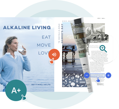
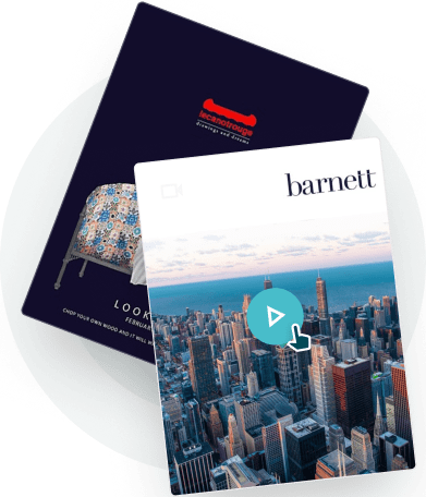
Interactivity That Respects Accessibility
Marketers need interaction that drives action because readers bounce when content is hard to consume. Small text, low contrast, and rigid layouts kill momentum. With Paperturn interactivity plus the UserWay widget, readers tailor the experience in one click—driving deeper attention, clearer CTAs, and measurable outcomes for assets like digital white papers.
Everything You Need to Make Interactive Content Easier for Every Reader
Reader Controls
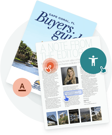
Offer contrast modes, larger text, a dyslexia-friendly font, highlights, and keyboard navigation. Readers choose what helps them; you keep one on-brand link.Text-to-Speech
Let visitors listen to content from an online magazine or navigate without a mouse. Built-in controls support screen-reader workflows and tabbing.Customized Profiles
A simple setup for common needs. Advanced options in our document management software let users fine-tune fonts, colors, and spacing.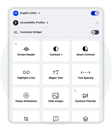
Inclusive Interactivity That Protects Brand, Reach, and Results
Pair Paperturn Interactivity with the UserWay accessibility widget to make flipbooks easier to read and act on. Readers personalize viewing while you keep control: one URL, no code.
Why Marketers Choose Accessible Interactivity
Reach More of Your Audience
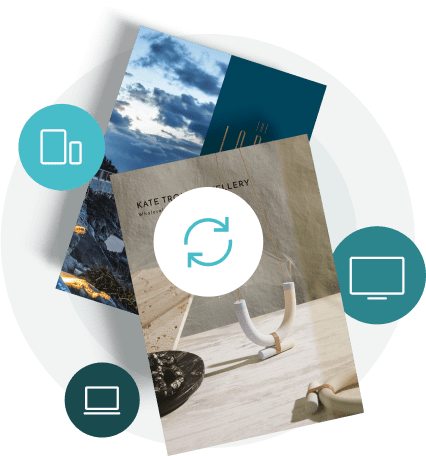
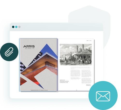
Reader controls reduce common barriers such as small text, low contrast, difficult navigation, so more visitors stay with your story. Interactivity remains smooth on mobile and desktop, increasing the chances that CTAs, forms, and links get the attention they deserve. This matters whether you’re creating online brochures, pamphlets, or sports team brochures.
Protect Brand and Compliance
Be transparent and responsible. Our UserWay integration improves accessibility for many users; for formal WCAG conformance, pair your flipbook with a tagged PDF/HTML alternative. Clear language, consistent design, and on-brand controls keep marketing safe and trustworthy.

"We use Paperturn to digitally publish our brochures and magazines, and the experience has been nothing short of exceptional. It’s a powerful tool that truly elevates our brand presentation."
Dan Cuomo
VP of Marketing


Improve Engagement and Conversion
When content is easier to consume, readers spend longer with it, making them more likely to click, share, or submit a form. Keep a single, evergreen link while updating assets behind the scenes to support ongoing optimization.
Built for Campaigns: Control, Speed, and Scale
One Link, Always Up to Date
Overwrite content without breaking links. Promote confidently across channels knowing your audience will always see the latest version.Embed Anywhere, Load Fast
Drop flipbooks into landing pages, blogs, and portals. Our HTML5 viewer keeps interactivity smooth with your content.Analytics Ready
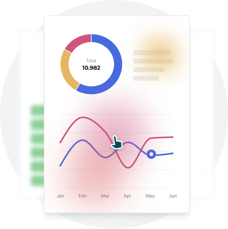
Track views, clicks, and page-level behavior in our catalog software. Use insights to validate the impact of reader controls on engagement.Inclusive Interactivity. No Slowdown.
Our vision is marketing that works for more people. We’re investing in deeper accessibility while preserving the speed and polish marketers need. Today, the UserWay widget improves usability for many readers; for formal WCAG conformance, provide an accessible alternative alongside your flipbook.

Ready to Boost Engagement the Inclusive Way?
Start your free trial. Enable reader controls, keep one link, and give every visitor a better way to engage, then measure the impact in your analytics.


